Funnel Chart can be very useful to show stages and proportions in the sales process. Despite its importance, creating a nice Funnel Chart in Excel can be little tricky. In this step-by-step you will be able to create a nice one, following the example below.
Showing posts with label excel 2016. Show all posts
Tuesday, February 7, 2017
Sunday, May 22, 2016
Customize Line Charts To Boost Your Data Credibility - Create and Learn
Wednesday, May 4, 2016
Treemap and Concatenate function. Create and Learn.
Use the CONCATENATE function to improve your TREEMAP data labels.
TREEMAP is a hierarchical chart; it shows how the parts of hierarchy compare in size to each other.
CONCATENATE, one of the text functions, to join two or more text strings into one string.
Try this step-by-step to Create and Learn Excel.
Labels:
budget,
busine,
chart,
concat,
concatenate,
excel,
excel 2016,
marketing,
office,
treemap
Monday, May 2, 2016
Charts + Pictures = Eye-Catching Information! Create and Learn
Studies have found that 90% of the information that we remember is based on visual impact. Try this step by step and learn how to use charts and pictures to create great eye-catching information.
Labels:
chart,
Dashboard,
excel,
excel 2016,
infographic,
link,
objects,
pictures,
presentation,
shapes,
visual
Sunday, May 1, 2016
VLOOKUP + Data Validation. 10 Steps. Create and Learn
Use them together to create great dynamic information in your spreadsheet:
VLOOKUP: use one of the lookup and reference functions, when you need to find things in a table or a range by row.
Data Validation: Use to control the type of data or the values that users enter into a cell.
Thursday, April 28, 2016
Create beautiful Infographics in Excel - Create and Learn
Infographics are great communication tools and have been used through every media available. You can create beautiful Infographics by using Ms Excel. Try this step by step. Share and let me know if you liked :)
Labels:
chart,
Dashboard,
Doughnut,
excel,
excel 2016,
graficos,
infographic,
office,
shapes,
smartphone,
Table,
world map
Wednesday, April 27, 2016
Using Shapes to improve your presentation. Create and Learn
This post will show you how to use shapes, images and custom colors to improve your information and make it more attractive.
Tuesday, April 26, 2016
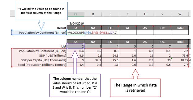
VLOOKUP in 3 Images
Those 3 images from the book Dynamic Infographics, can help you to understand the "VLOOKUP steps". Try the second image in your excel and follow the colors.
Blue - What are you looking for?
Red - Where do you want to search?
Purple: If you found, which column Excel will retrieve your data?
Yellow: Exact match? Ok, type "0" (zero).
Have fun :)
Book - Budget Control - Create and Learn
This book will help you learn the key concepts of MS Excel in less than 24 hours. You will create a budget control sheet with Upside and Downside, formatting, building graphics and preparing printing.
Subscribe to:
Posts (Atom)